

Priori: A Better Table
At Priori, we use a lot of tables. Our tables require a lot of organization of data and often we find ourselves packing in a lot of information into tables that need to scale across different device sizes.
Duration:
1 month (two two-week sprints) plus another month for dev integration
Team:
Manuela Odell (Lead designer), Mirra Levitt (Product manager), Nick Olivo (Product manager), Mike Milner (CTO)
The Problem
In long tables that have a lot of numbers, users get frustrated by having to scroll back up to remember the data field in the table. Is there a way to alleviate that pressure for our users without losing any relevant data information?
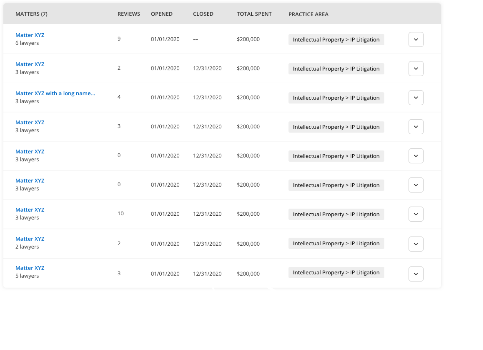
Collapsed/Default Table View
Our “Matters” table (a table that has information on a legal company’s projects, often has hundreds of rows. While we only show ten at a time before a user has to go to the next page, there are so many different data points that it is easy for a user to forget what numbers mean what.
Expanded Table View
A matter can also be expanded to see what lawyers worked on a specific project, however, in the case where there are many lawyers, the information gets lost as a user scrolls down the page. Additionally, there was a lot of dead space if there was only a single lawyer.

In addition to the above notes on the table, our users wanted another piece of data on this table; the diversity data of each individual lawyers. This could be anywhere one word or 10 different diversity words. It would be important to design something that accommodates empty states, as well as many words.
Designing a better table - iteration 1
The first thing we did was to make each lawyer card horizontal and one per row instead of two columns. This allowed for a cleaner display when there was only one lawyer card.
In addition, we decided to bring down the headers of the table into each row so that regardless of how many lawyer cards and regardless if a user expanded the table, you could always see what data you were looking at.

Talking to our users
We received great initial feedback from our users. They liked that they could always understand the data being shown but it still looked clean. Despite it being a new type of table, they found it easy to understand.
However, at the same time of redesigning this table, we were adding another element to our product - Reviews. Our clients would be able to write reviews on individual lawyers working on specific matters or general reviews. This table seemed like the perfect place to see these reviews since we were able to get a macro view on the matters.
Adding reviews
In this table, we identified three different pieces of information to express on this table:
How many reviews a lawyer had
How many reviews a matter had
The average review score of a matter
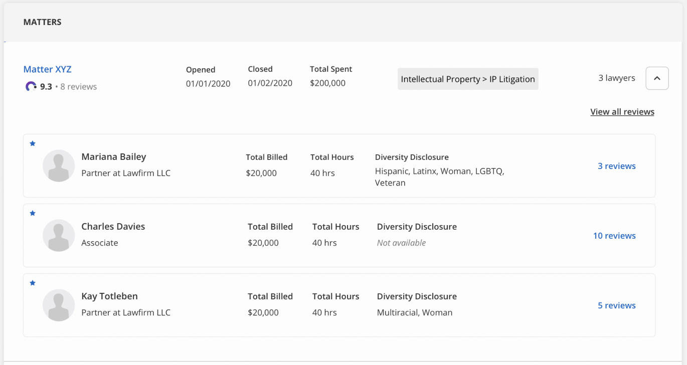
We created a little colored graphic to highlight the overall matter score, as well as adding how many reviews this score included. This was important to our users because they want to quickly assess how important a score is. If it’s a score based on one review, it is not as relevant as a score based on many reviews.
Final Table
Our final table had to also include a matter number, a sequence of numbers, letters, and characters (up to 20). This number is a way for our clients to search a matter, specifically ones that are confidential.

Post-Mortem
This project was a whirlwind of ideas, resurrecting old ideas, and adding new items to our table. There was a point in this project where I almost said no when we heard that our clients wanted to add more to this table. As a designer, it’s important to know when to push back and say that we can’t do something.
When we came up with the designs, I was skeptical. Mostly because we were fitting a lot of information and scaling across devices would be challenging. However, I was mostly excited about having a new table design for our future complex tables.