
Priori Legal: Updating a legacy editing pattern
Editing profile information is a key action our users take frequently. We had a complex editing function with our practice areas & proficiencies which had two layers of options.
Duration: 2.5 months
Team: Manuela Odell (Lead designer), Nick Olivo (Product manager), Mike Milner (CTO)
Impact: 100% decrease in customer service tickets related to practice area editing modal

THE PROBLEM
We allow our lawyers and clients to edit their own information. If a lawyer cannot figure out how to edit their data, they reach out to our support team. One such example is our Practice Areas editing modal, which allows our lawyers to add a practice area and then a proficiency within that practice area. We were spending a lot of time helping lawyers walk through how to edit this information. Could we redesign it so that it was more straightforward?

Original Practice Area Editing Modal

When we showed our practice area modal to our users, their feedback was that it wasn’t clear enough that the right side box was connected to the left side box. The action to take was not clear to our users and when a proficiency was missing, it felt awkward to have to do two steps (add and then say “yes”). Additionally users didn’t know what they were saying “yes” to.
V1 of Practice Area editing modal
The first iteration of the practice area modal was moving to a more vertical design, where the subcategories were below the category, instead of on the right. The assumption was that this would make it clearer what a user was editing.

In an early design critique, I showed this option for the practice area editing modal. While the design made it clear what a user was editing, we worried that an editing modal like this could get very long and messy as a user would occasionally have to scroll a lot to find their subcategory.
Research
We decided to take a look at other designs to see if we could be inspired by similar patterns out in the wild. The two we focused on were Airbnb & DoorDash.
Airbnb

DoorDash


Both Airbnb, DoorDash and other apps we found, brings you to a new page to edit subcategories. While DoorDash shows this option on a modal overlayed on the main screen, we were not sure if we wanted to deviate from our design system. We have never swapped a modal for the next screen. Additionally, we needed the ability to remove entire categories and subcategories.
Iterate
What we did like about Airbnb is the option to be in “editing mode” but the default is to show the options that already exist. We decided to try this by having a default version where all the selected subcategories are shown but that an editing button takes you to a new view and interaction.

Inspired by the Airbnb design, I created this modal to allow the user to see a macro view of everything that currently is visible on their profile and giving less emphasis on the editing aspect. The second view is what it looks like in editing mode.
After discussions with our team, we felt that the editing expansion was confusing for users. We tried to gray out the button so there was one button to focus on while editing but it still felt busy and overwhelming.
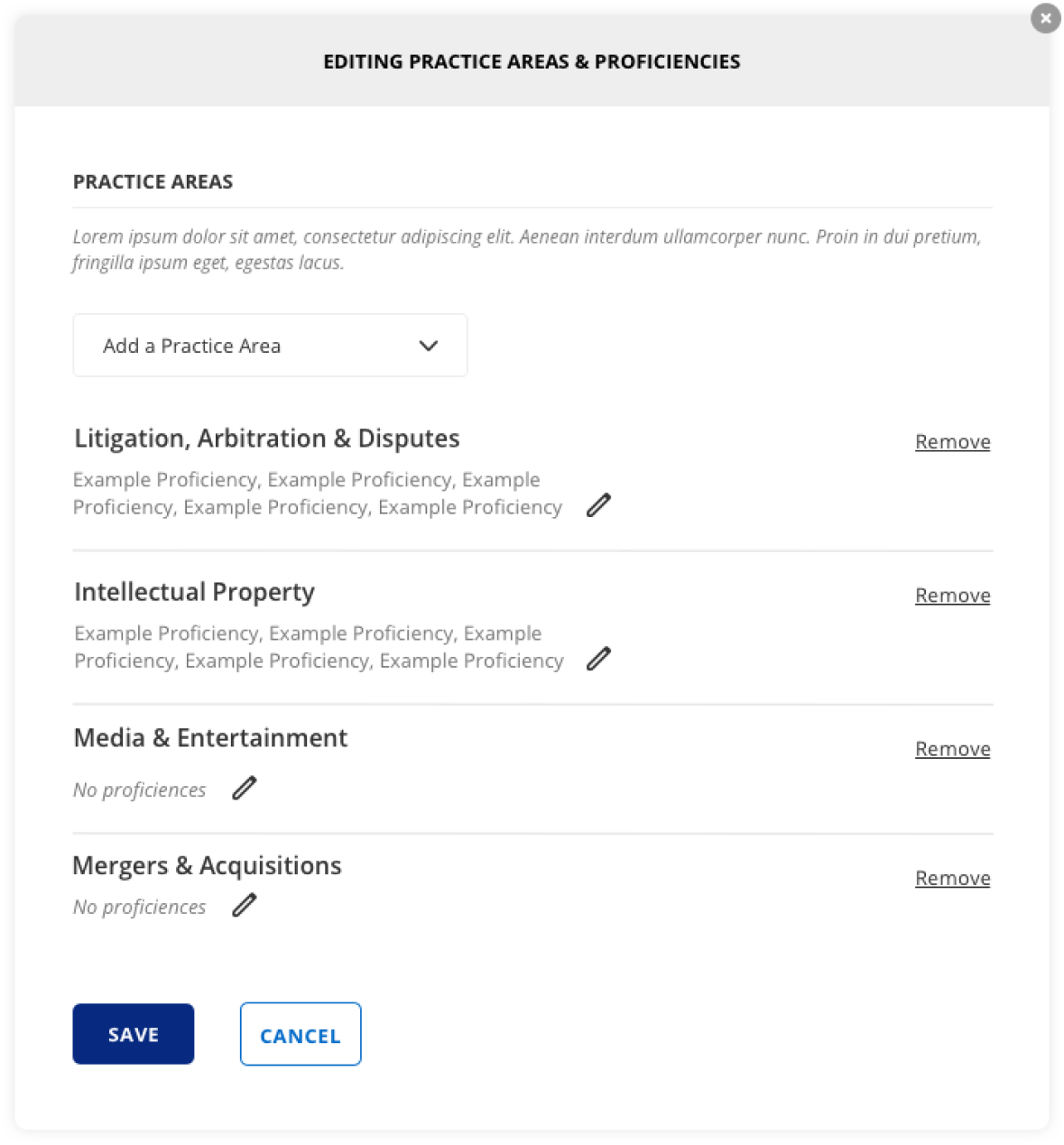
Final Version


We decided to pull in an existing tag pattern for showing the subcategories instead of the checklist. This both saves us space and development time but also creates more efficiency in our product. With the checkbox list, we had to ask ourselves what do we do when someone deselects a proficiency. Do we delete it from our system?
Post Mortem
Priori to redesigning this feature, our sales reps didn’t like showing this feature because it didn’t flow particularly well. It was bulky and there was a lot of room for error. After we redesigned it, webinars went much more fluidly
We were also able to successfully decrease customer service tickets related to this feature by 100%.
This project was a reminder of why it’s important to think outside the box. We try to usually stick to our design system but it is important to recognize when a pattern won’t work and to abandon the idea quickly. I was proud at how quickly we were able to switch careers to find a better solution.