

Venmo Savings
Adding a new personal finance feature to the existing Venmo app
Scroll ↓
This is a speculative project
Project Details
Timeline: January 2020
Duration: 80 hours
Team: Individual project with feedback from peers and mentor
Deliverables: Product Design, UX Research, Mobile UI Design, Prototyping, Usability Testing
The Challenge
Venmo ‘s mission is to make the transfer of money between users as fast and easy as possible. And they have succeeded! With over 40 million users on their mobile app, and the majority of them millennials splitting rent, bills, and dinner, it has followed in the footsteps of other great products, in which “Venmo-ing” has become a verb. In order to continue to grow and retain their users, Venmo wants to add a personal finance feature into their existing app.
Design Process

Research
Research Goal: To understand the goals and needs of the Venmo users and develop a feature that solves those needs.
Methodologies: Market Research | Competitive Analysis | Heuristic Evaluation | Provisional Personas
Market Research
Market research was conducted to understand the industry. I focused on Venmo demographics and millennial saving trends. What became apparent through market research was the general distrust that millennials have with banks. I immediately could see the unique position Venmo was in as a millennial-trusted FinTech app.
Millennial Financial statistics
45% of millenials have a retirement savings account such as a 401K or IRA
33% are actively contributing to it
25% of millennials expect to rely on social security and pensions, while 45% say their personal savings will be more important
1 in 6 millenials have over $100,000+ in savings
61% of older millennials had less than $1000 in their savings account
41% of older millennials had nothing
In 2017, 46% of millennials have $0 in savings
Venmo Statistics
Venmo is only available in the US
Venmo has over 40 million users, as of April 2019
26% of young millenials use Venmo
34% of older millennials use Venmo
25% of Gen Xers use Venmo
Venmo is accepted at over 2 million retailers
Competitive Analysis
I conducted a competitive analysis with Venmo’s direct and indirect competitors to understand what they do better or worst.

Heuristic Evaluation
Using Nielsen and Molich’s interface guidelines, I did a heuristic evaluation on Venmo to make sure I keep those strongly in mind as I design the new feature.

Match between system and real world: When transferring funds, using “request” and “pay” are commonly used and are very clear in which direction the transfer goes in.
User control and freedom: The clear “Cancel” button which has an equal hierarchy as who the payment goes to, makes it easy for you to cancel a transaction.
Error Prevention: After choosing “Pay” a large green CTA has you double check that that’s the transaction you want to do. If not, the Cancel button is clear on the left top.
Visibility of System Status: After paying someone, a page indicates the system status with a bar on the top moving across the page and content that says “paying [name]…” making it clear where you are in that process.
Flexibility & Efficiency of use: The icons clearly indicate what action pressing them will take.
Recognition rather than recall: The green type for when you receive money and red type for when you pay someone is a great way to indicate the type of transaction that happened.
Consistency & Standards: Regardless of the complexity of the task, there is a clear consistency across the app and it abides by typical UX patterns and standards.
Aesthetic & Minimalist design: Venmo uses white space and loose padding to create a minimalist aesthetic. Additionally, the color scheme is simple.
Help users recognize, diagnose, and recover from errors: Venmo makes it very clear when you have made an error and gives you a clear CTA to recover from that error.
Help & Documentation: Venmo provides easy access to help and documentation options in the settings.
Provisional Personas
I then created three different provisional personas that would help guide my interview participants.

User Interviews
In order to conduct primary research, I interviewed six Venmo users, two male, and three female, who lived in major cities like San Francisco, Boston, and New York. I asked them open ended questions about their Venmo and saving habits.
Define
Goals: To define the user’s goals, needs, frustrations, and motivations through research synthesis.
Deliverables: Empathy Map | User Persona
Empathy Map
Once I conducted the user interviews, I created an empathy map with every thought and quote that my users said. From there, I organized it by thinking'/feeling, doing, saying, and hearing. Then I pulled out patterns across the empathy map.

User Persona
My empathy map lead me to my user persona, whose goals, motivations, needs, and frustrations, are based on my research.

Ideate
Goals: To brainstorm ways to solve the user’s needs & goals
Deliverables: POV & HMW | Individual Brainstorm | Group Brainstorm | Strategy | Product Roadmap | Sitemap | Task Flow | User Flow
POV & HMW
Once I had my user persona, I built out POV statements and How Might We questions which would be the vehicle for all the brainstorming.

Brainstorming Session
I ran an individual brainstorm session, in which I did two two-minute rapid-fire ideation to answer the HMW questions.

Group Brainstorming Session
From there, I ran a brain thinking brainstorm session with five other friends. It was my own version of the 6-3-5 Brain Writing Technique, in which I gave each person a sticky pad & pen. We did two rounds of two-minute rapid-fire ideation on the HMW questions. In the second round, they could either come up with new ideas or build on existing ideas. In the third round, we discussed our favorite ideas and unanimously built upon those. The result was a large compilations of ideas to solve the HMW questions.

Business, User, and Technical Considerations
I then identified the business goals based on research, and user goals based on my personas. Where these diagrams overlap is where I focused my project.

Product Roadmap
I created a product roadmap to determine the main features my product would have and the priority.
App map
It was important to understand where the Venmo feature would fit in to the architecture of the existing Venmo app so I created an app map. This helped me visualize where Venmo Savings would fit in.

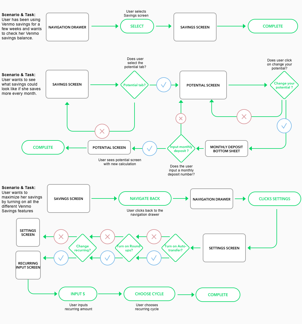
Task Flow
In order to understand how a user completes a task, I created a task flow and three individual tasks. This helped me understand the flow of the feature.

User Flow
A user flow was integral into understanding the flow of the app and highlighting any points of contention within the app.
Design
Goals: To develop the first iterations for the Venmo Saving feature
Deliverables: Low Fidelity Wireframe Sketches | UI Kit | High-Fidelity Wireframe Mockups
Low-Fi Wireframes
Based on my task & user flows, I started building out my first iterations of my low-fi wireframes, based on existing Venmo patterns.

UI Kit
Using the color dropper tool, and recreating common Venmo design elements, I developed a UI kit that would help guide my own Venmo feature to match with the overall Venmo aesthetic. I even created new icons that I would need for my screens!

High-Fidelity Wireframes
I crated my first version of my high-fidelity wireframes to do some usability testing amongst users. Below is the first version of the Venmo Savings feature.
Some important notes:
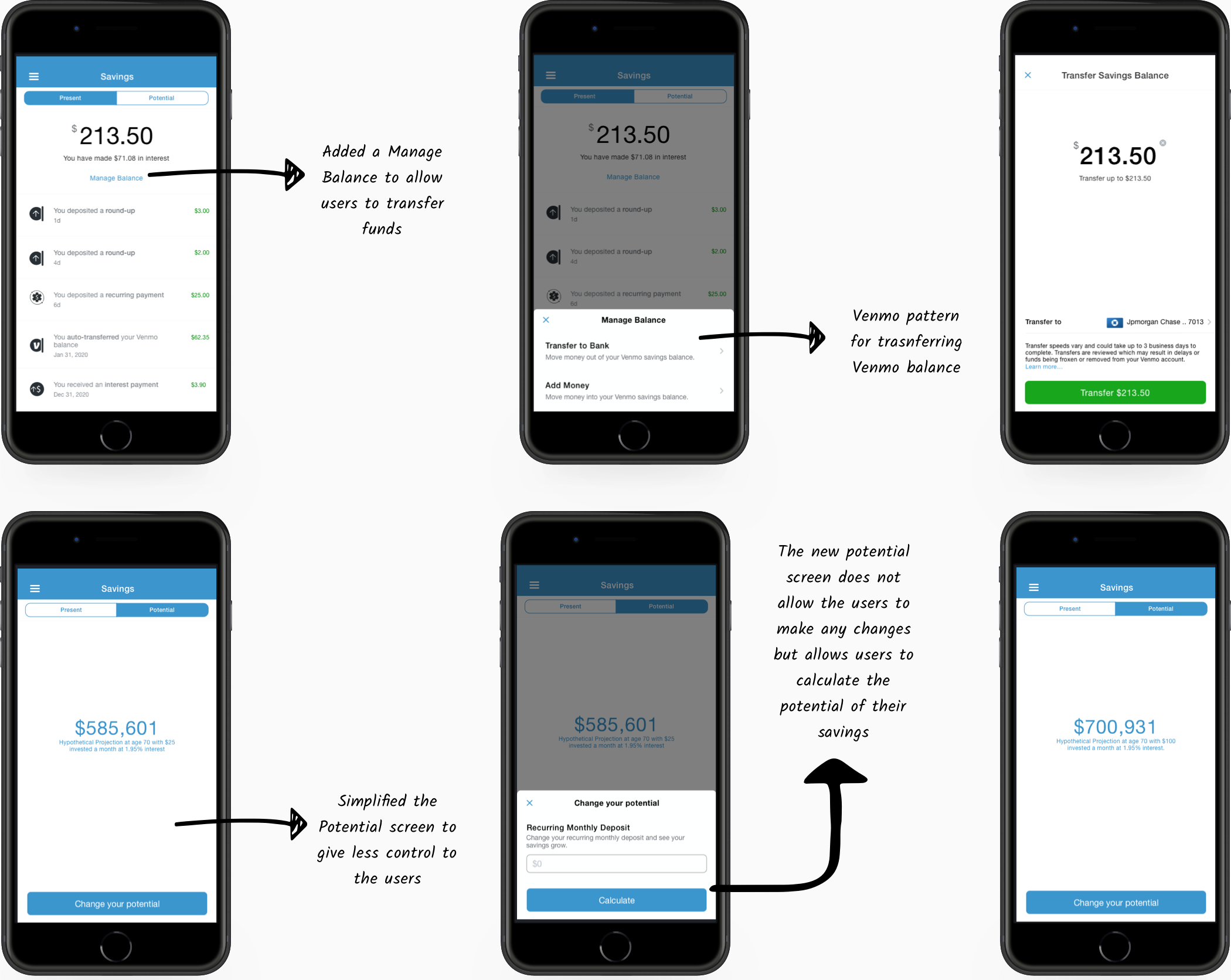
I chose to include Savings under “Preferences” in the Settings menu because as of right now, the feature is limited and it made sense to be nestled in other settings related to transactions. When the Savings product grows and develops, I expect it to be under its own section in Settings.
The graph in the Potential screen is interactive and that dot can be pulled up and down that graph to see the hypothetical projection change

Prototype
Goals: To develop a high-fidelity wireframe to test amongst users
Deliverables: High Fidelity Prototype | Usability Testing | Affinity Map
Usability Testing
In order to test the Venmo Savings feature amongst Venmo users, I developed a high-fidelity prototype in Invision with three complete task flows. This would allow me to test complete functionality of the feature and collect valuable feedback for the iteration stage. In order to test the functionality of my Venmo feature, I recruited five participants and had them go through a series of scenarios and tasks.
The tasks were:
View your Venmo savings account
Change your Venmo savings potential
Update features to maximize Venmo savings
Affinity Map
Once I had completed my testing, I added every note, comment, and observation onto an affinity map. From there, I pulled out patterns to figure out what I should update in my wireframes.

Insights:
Participants don’t know how to read the potential screen and are unclear about what it is showing them
The settings in two different places is confusing for user
It is unclear what the skip button does
Participants were unclear if “change your potential” changes the amount investing permanently or temporarily
Recommendations:
Quick Wins:
Create consistency across settings - they should be all in one place or all in both places.
Create stronger design hierarchy with potential settings updates
Fill Ins
Remote Skip Button
Major Projects
Change Potential screen by simplifying graph and giving less control to user
Thankless tasks:
Add savings settings to savings screen, instead of under settings
Iterate
Goals: To make changes based on user testing and create a second iteration to fulfill user’s needs and goals.
Deliverables: Revised Wireframes | Revised Prototype | Conclusion | Next Steps
Revised Wireframes
Once I prioritized what to change, I went back to recreate some low-fi wireframes. One major thing that came about from my research was that I had given my users too much control in the potential screen. The potential screen was overly complicated, when the goal was quite simple: to show users what their savings would look like if they saved more.
Additionally, I added a “Manage Balance” because it’s a Venmo patterns and I realized I had given my users no way of actually transferring their funds back into their checking.
Revised Prototype
Conclusion
This project was challenging as I had to work within the confines of the Venmo brand and create a complex feature in an otherwise simple app. However, in the end, I created a feature that fulfilled the needs and goals of the Venmo user. There is a lot I learned from this project.
What went wrong and why? Three user testing sessions in, I realized that one of my screens was very confusing for my users. It was frustrating to carry on with my testing because I wanted to change it. In retrospect, I wish I spent a bit more time on my high-fidelity wireframes, including getting some feedback from other designers before putting it in front of users.
What could I have done better? Understanding the flow of the app was difficult. I could have done a better job mapping out the flow of the app feature in advance of designing it. In fact, once I created my low-fi wireframes, I had to go back to fix my user flows and task flows to match up with the new wireframes.
What did I learn? This was a great project in really understanding how non-linear the design process is. In doing this project, it emphasized the important of keeping documents organized, including artboards in Sketch and research documents.
Next Steps
With more time, since I made major changes to the potential screen, I would liked to do more usability testing. Additionally, I would like to flesh out the savings feature with the following:
Adding specific savings buckets where users can save for specific items and goals
Partnering with an investment fund to offer ETF’s to our users
Partnering with an IRA company to offer retirement plans to our users